
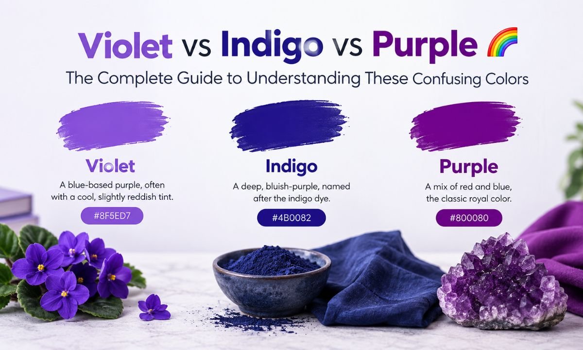
Most people use violet, indigo, and purple as if they mean the same thing. They don’t. One is a genuine wavelength of light that your eyes can physically detect. One is a historical placeholder that Isaac Newton added to make his color wheel match a musical scale. And one doesn’t exist in light at all — it’s something your brain builds after the fact.
If you’ve ever argued with a friend about whether a sunset is purple or violet, or wondered why indigo even counts as a rainbow color, this guide sorts out the science, the history, and the everyday visual cues so you can tell them apart on sight.
By the end, you’ll know exactly what separates these three shades, where each one shows up in nature and design, and how to mix accurate versions of each in paint, ink, or digital color codes.
Scientific Definitions: The Real Spectrum Positions
Visible light sits inside a narrow band of the electromagnetic spectrum, running from roughly 380 nanometers to 700 nanometers. Every hue you see in a rainbow corresponds to a specific wavelength inside that range. Violet and indigo both belong to this group. Purple does not, and that single fact changes everything about how these three colors behave.
Violet: A True Spectral Color
Violet sits at the very edge of what human eyes can register, roughly between 380 and 435 nanometers. Because it has the shortest wavelength we can see, it borders ultraviolet light, the range that’s invisible to us but visible to some insects and birds.
Violet light stimulates the blue-sensitive cone cells in your eye strongly while barely activating the red-sensitive cones. That lopsided response gives violet its cool, slightly electric quality. It’s also why violet tends to look darker than you’d expect for such a vivid hue: the cones responsible for brightness perception aren’t especially sensitive to this wavelength.
One detail trips up a lot of people: true spectral violet can’t be perfectly reproduced on a screen or in a paint mix. A monitor approximates it by blending red and blue light, but a genuine violet wavelength is a single frequency, not a combination. What you see on your phone is a close cousin, not the real thing.
Indigo: The Controversial Color
Indigo occupies a strange middle ground. It sits between blue and violet, generally cited somewhere around 420 to 450 nanometers depending on the source, and it owes its place in the rainbow almost entirely to one person: Isaac Newton.
In the 1600s, Newton divided the visible spectrum into seven named colors. Many historians believe he did this because seven matched the number of notes in a musical scale, not because indigo was visually distinct enough on its own. Modern color researchers have pointed out that most people, when shown a spectrum without labels, struggle to mark where blue ends and indigo begins, or where indigo ends and violet takes over.
That doesn’t mean indigo lacks a real identity. In practice, it reads as a deep, saturated blue with a quiet purple undertone, closer to navy than to true purple. Think of the color of raw denim or a night sky just before full darkness. It’s darker and cooler than violet, and it leans toward blue rather than red.
Purple: A Color Your Brain Creates
Purple has no wavelength at all. It’s not part of the visible spectrum in the way violet and indigo are, which is why you will never see a genuine purple band in a rainbow. Instead, purple is what neuroscientists call a non-spectral color: your brain manufactures it when your eyes detect red and blue light hitting the retina at the same time.
This happens because your red-sensitive and blue-sensitive cones sit at opposite ends of the visible spectrum. Normally, wavelengths in between (green, yellow, orange) activate a smooth gradient of cone responses. But when only the two extremes fire together, without the middle wavelengths present, your visual system interprets that unusual combination as a brand-new hue rather than a blend. That interpreted hue is purple.
Because purple is created by mixing rather than detected as a single frequency, it’s also the broadest of the three terms. It covers everything from pale lavender to deep plum, and it’s the color most people reach for casually, even when they technically mean violet or indigo.
Visual Differences: How to Tell Violet, Indigo, and Purple Apart
Once you know the science, the visual cues become much easier to spot. Violet and indigo are the pair most often confused, since both carry cool, blue-leaning undertones. Purple is usually the easiest to separate out because of its warmer, redder character.
Quick Identification Table
| Feature | Violet | Indigo | Purple |
|---|---|---|---|
| Spectral color | Yes | Debated, historically yes | No |
| Approximate wavelength | 380–435 nm | 420–450 nm | None (mixed hue) |
| Hue lean | Blue with a reddish edge | Strongly blue | Balanced or reddish |
| Typical brightness | Lighter, more vivid | Darker, more muted | Varies widely |
| Found in a rainbow | Yes | Traditionally yes | No |
| Common hex reference | #7F00FF | #4B0082 | #800080 |
How to Spot the Difference Fast
A few quick mental checks will get you the right answer most of the time:
- If it looks bright, cool, and slightly electric with a hint of red, you’re probably looking at violet.
- If it looks deep, dark, and navy-adjacent with a whisper of purple hiding underneath, that’s indigo.
- If it looks warm, balanced, or noticeably reddish, call it purple.
- Lighting changes everything. Warm interior light nudges violet toward purple, while cool daylight nudges purple toward violet, so always judge a color in natural light when you can.
Historical and Cultural Context
Color names carry centuries of trade, religion, and status behind them. Violet, indigo, and purple each built a very different reputation over time, and that history still shapes how we use the words today.
1. Violet: The Color of Mystics and Royal Gardens
Violet has long been tied to spirituality and refined taste rather than raw political power. In Byzantine art and medieval manuscripts, violet tones frequently represented divine light, appearing in stained glass and religious paintings where a mystical, otherworldly mood was needed. Violet flowers, lavender fields, and pale amethyst gemstones reinforced this gentler, contemplative association, distinct from the harder, more commanding reputation that purple would eventually claim.
2. Indigo: A Dye That Shaped Civilizations
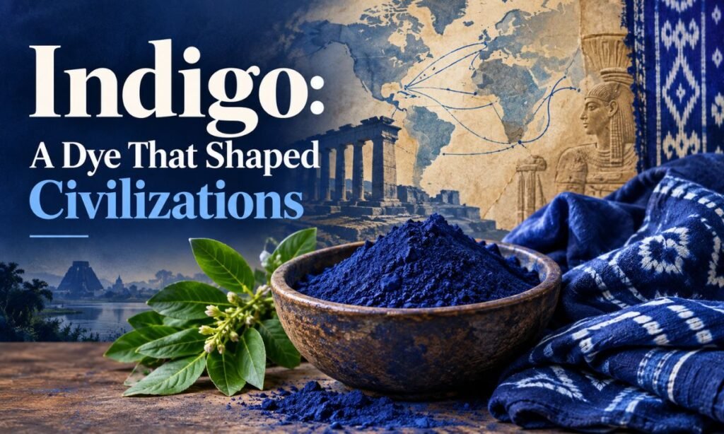
Indigo has one of the richest and longest trade histories of any pigment on earth. Derived mainly from plants in the Indigofera genus, the dye dates back thousands of years and was used across ancient Egypt, India, West Africa, and eventually Europe. Because producing a stable indigo dye was labor-intensive, the pigment earned the nickname “blue gold” in some trading circles.
By the 17th and 18th centuries, indigo plantations had become central to colonial economies, particularly in India and parts of the Americas, driving both immense profit and immense human suffering under forced and exploited labor. Today the legacy of that dye survives in something far more casual: the blue of your jeans traces directly back to indigo, and traditional Japanese textile dyeing techniques still rely on the same plant-based process developed centuries ago.
3. Purple: The True Royal Shade
If any of these three colors deserves the word “royal,” it’s purple. Ancient Tyrian purple was extracted from the mucus glands of sea snails found along the Mediterranean coast, and the process required thousands of snails to produce a small amount of usable dye. That scarcity made the color absurdly expensive, so expensive that laws in Rome and Byzantium restricted its use to emperors and high nobility.
The phrase “born in the purple,” used to describe a child born into royal privilege, comes directly from this imperial dye tradition. Long after synthetic dyes made purple affordable for everyone, the color kept its association with luxury, ambition, and status, a reputation that violet and indigo never fully acquired.
Symbolism and Emotional Interpretation
Color psychology isn’t an exact science, but consistent patterns show up across design research and cultural studies. Each of these three shades tends to carry a distinct emotional signature.
Violet Symbolism
Violet is generally linked to creativity, imagination, and a certain restless energy. Brands and artists reach for violet when they want to suggest originality or a touch of eccentricity without the heaviness that darker purples can bring.
Indigo Symbolism
Indigo reads as calmer and more grounded. People associate it with depth, intuition, and stability, which is part of why it shows up so often in professional and spiritual contexts, from meditation branding to corporate palettes that want to feel trustworthy without being cold.
Purple Symbolism
Purple carries the broadest emotional range of the three. Depending on the shade, it can suggest luxury, spirituality, mystery, or nostalgia. Lighter purples like lavender tend to feel soft and calming, while deep plum or eggplant shades lean formal and dramatic.
Color Mixing in Art and Design
Because only purple can technically be “mixed” in the strict scientific sense, artists have developed workarounds for approximating violet and indigo using pigments, which behave differently than light.
Mixing Violet
Painters typically build violet by combining a cool blue, such as ultramarine, with a small amount of red or magenta. Keeping the ratio blue-heavy helps preserve violet’s characteristic coolness rather than letting it drift into standard purple territory.
Mixing Indigo
Indigo is usually approximated with a dominant blue base (often a deep phthalo or ultramarine blue) tinted with a small touch of violet or black to push the value darker. The goal is a shade that still reads as blue at a glance, with only a subtle purple undertone once you look closely.
Mixing Purple
Purple is the most straightforward of the three to mix, since it’s genuinely a combination color. Equal or near-equal parts of red and blue pigment produce a balanced purple, while shifting the ratio toward red creates a warmer magenta-leaning purple, and shifting toward blue creates a cooler, violet-leaning purple.
Creating Accurate Shades: Ratio, Temperature, and Medium
Getting these colors right consistently comes down to three practical factors that working artists and designers pay close attention to.
Ratios Matter
Small changes in pigment ratio produce noticeably different results. A 60/40 blue-to-red mix reads very differently from a 50/50 split, so it helps to test small batches and record what worked before committing to a large mix.
Temperature Adjustments
Every pigment carries an inherent temperature. A warm red (like cadmium red) pushed into a blue mix will produce a muddier, browner purple, while a cool red (like alizarin crimson or magenta) keeps the resulting purple clean and vibrant. The same logic applies to blues used for indigo and violet.
Medium-Specific Tips
- In watercolor, layering thin glazes of blue and red produces cleaner violets and purples than mixing them wet-on-wet, which can turn muddy fast.
- In acrylic and oil paint, a small amount of white lightens violet without shifting its hue much, while black deepens indigo without killing its blue undertone.
- In digital design, working in HSL or HSB color mode rather than plain RGB sliders makes it much easier to nudge hue, saturation, and lightness independently when you’re chasing an accurate violet, indigo, or purple.
These Colors in Nature
All three shades appear constantly in the natural world, though not always for the reasons you’d expect.
Violet in Nature
Violet flowers, from African violets to certain orchids, get their color from pigments called anthocyanins that reflect light in a way that approximates the true spectral hue. Violet also appears briefly at the edge of rainbows and in some deep-sky photography, where short-wavelength light scatters distinctly.
Indigo in Nature
Beyond the Indigofera plant itself, indigo tones show up in deep ocean water, certain beetle shells, and the darker bands of twilight sky just after sunset, when blue light dominates but red undertones still linger.
Purple in Nature
Purple is common in fruits and flowers such as grapes, eggplants, lavender, and violets (confusingly named, since many “violet” flowers actually read closer to purple). These plants produce purple through pigment combinations that mix red and blue reflected light, mirroring the same red-plus-blue principle that creates purple in human vision.
Practical Identification Guide
If you only remember one section from this guide, make it this one. Here’s a fast way to check any color you’re unsure about.
Checklist
- Does it appear in a real rainbow or prism? If yes, it’s violet or indigo, not purple.
- Does it lean noticeably red or warm? If yes, it’s purple.
- Is it dark and navy-like with only a subtle purple hint? That’s indigo.
- Is it bright, cool, and slightly electric? That’s violet.
- Was it made by physically mixing red and blue pigment or light? It’s purple by definition.
Everyday Examples
- Violet: pansies, amethyst crystals, some grape varieties, ultraviolet-adjacent LED lighting
- Indigo: raw denim, indigo-dyed textiles, deep twilight sky, some beetle exoskeletons
- Purple: eggplants, lavender fields, royal robes in historical paintings, grape juice
Frequently Asked Questions
Why do people say violet instead of purple?
Violet is the technically correct term for the spectral color at the end of the rainbow, while purple is a broader, mixed color; many people use the words interchangeably out of habit rather than precision.
What happens if you mix indigo and violet?
You get a cooler, deeper blue-violet shade, since both colors already sit close together on the blue-leaning end of the spectrum.
Why is indigo no longer a color of the rainbow?
Modern color scientists argue that most people can’t reliably distinguish indigo from blue or violet, and Newton likely included it mainly to match seven musical notes rather than seven visually distinct hues.
Which is lighter, indigo or violet?
Violet is typically lighter and more vivid, while indigo is darker and more muted with a navy-like depth.
Conclusion
Violet, indigo, and purple look similar enough to blur together in casual conversation, but each one tells a different scientific and cultural story. Violet is a genuine wavelength of light sitting at the edge of human vision. Indigo is a historically debated shade that bridges blue and violet, carrying centuries of dye trade behind it. Purple is a color your brain constructs entirely, born from mixing red and blue rather than detecting a single frequency.